HPIBet.com
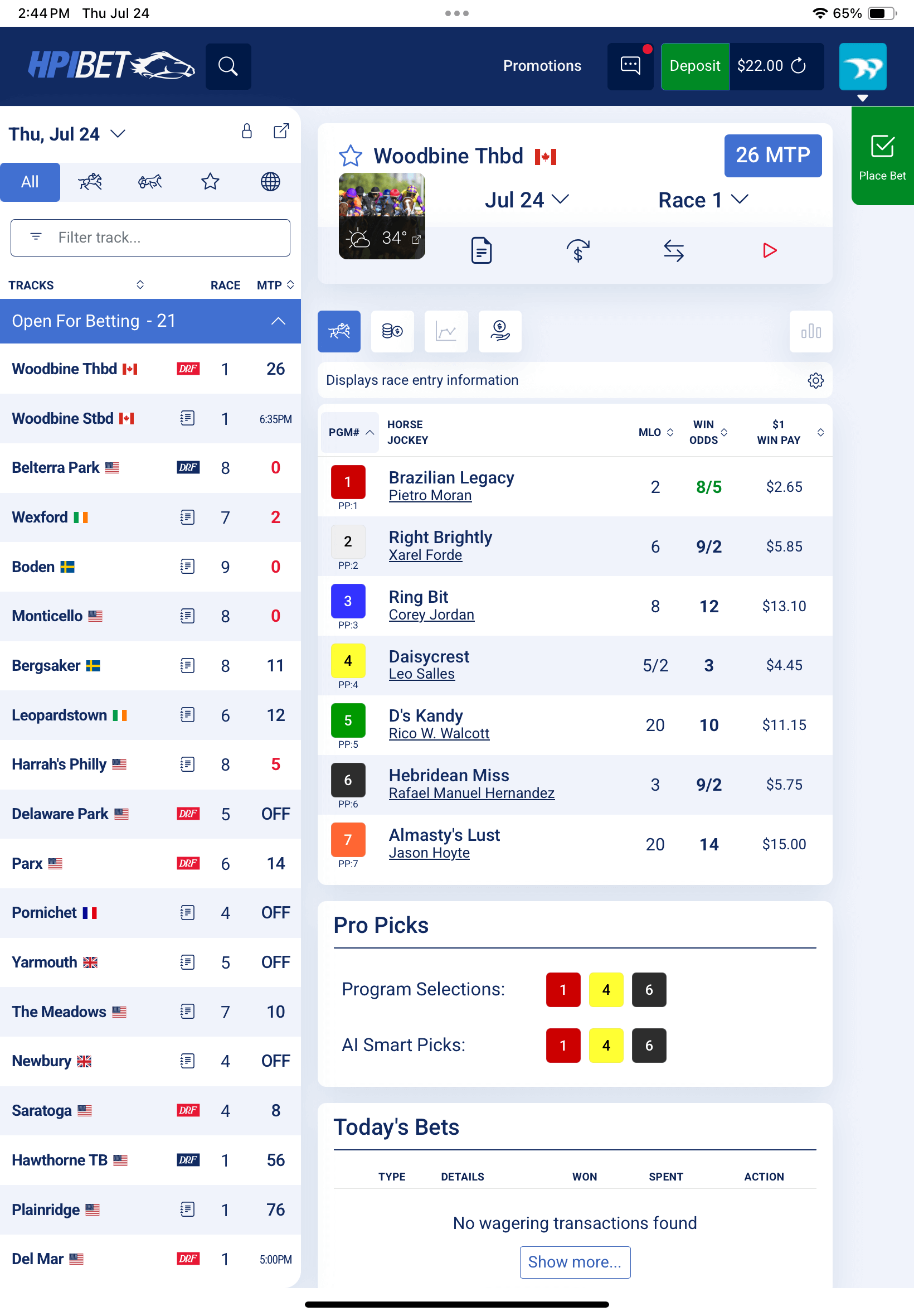
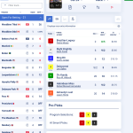
HPIbet.com presented us with a unique challenge: how do you take a traditionally complex and data-heavy experience like horse racing wagering and make it intuitive, modern, and engaging for both seasoned bettors and newcomers? The platform already had a loyal audience, but it needed a UX overhaul to meet evolving expectations. Our team approached this project with a design-first mindset, streamlining navigation and ensuring that information like race cards, odds, betting slips, and results making it easy to access at a glance. By decluttering dense data layouts and applying consistent design patterns, we created a platform that feels approachable without sacrificing the depth that advanced users demand.
One of the central pillars of our creative work was balancing tradition with innovation. Horse racing carries a long history and cultural significance, so the design needed to respect that heritage while still feeling fresh and modern. We incorporated a clean aesthetic with strategic use of color to highlight critical information such as live odds and race updates. The betting interface was reimagined with a mobile-first approach, ensuring usability across all screen sizes. We also invested heavily in micro-interactions, animations that help guide users through key actions, such as placing bets or checking live results. These touches not only improved clarity but also built a sense of momentum and excitement in the wagering experience.
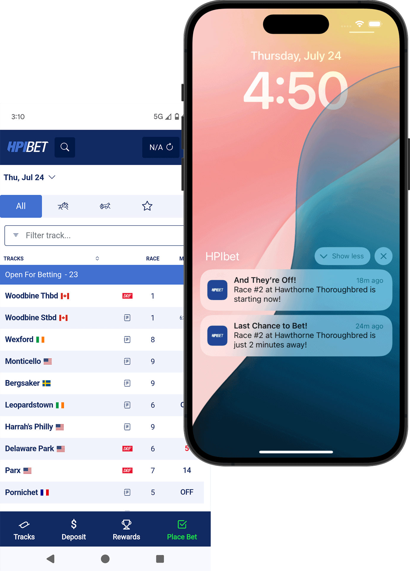
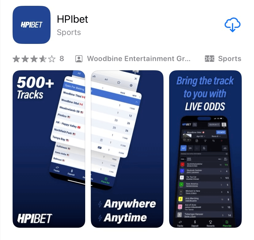
When HPIbet transitioned to mobile apps in iOS and Android, our work extended beyond responsive web design into native app adaptation. We optimized the UX to leverage mobile-specific patterns, such as thumb-friendly controls, gesture-based navigation, and real-time push notifications for race alerts. Creative consistency was a priority, so the look and feel of the apps remained unified with the desktop experience, while interactions were tailored to the expectations of app users. The result was a cohesive ecosystem where users could seamlessly switch between devices without friction. From a UX perspective, the project was a lesson in marrying complexity with simplicity; delivering powerful features in an experience that feels fluid, intuitive, and visually compelling.

