What is Business Intelligence
Business Intelligence (BI) is a term that covers the strategies, technologies, and software used to collect, store, analyze, and present data for business purposes.
BI can help businesses identify, develop, and implement new opportunities, strategies, and decisions based on insights from data. BI tools can provide user-friendly views of data, such as reports, dashboards, charts, graphs, and benchmarks.
BI can support a wide range of business decisions, from operational to strategic and it can also be used to forecast future performance based on historical trends.
In the past, obtaining insights from business data was a very laborious and time-consuming process. First, data would have to be gathered from a variety of paper and/or electronic sources. Next, the data would need to be organized and correlated so that the data could be represented in some sort of context. Then the data would be loaded into analytical tools, such as electronic spreadsheets and/or relational databases. Finally, computer analysis would be carried out to obtain information from the data. Depending on the complexity of a business, this process could take weeks, months, or even years.
“Information” is often defined as “data in context”. Using modern BI platforms and tools, such as Microsoft Power BI, this process is made automatic. Thes tools gather and contextualize vast amounts data to reveal information and present it through point-in-time reports (such as in PDF files), or online interactive dashboards that allow users to filter and display information in near real-time.
What are Key Performance Indicators
Key Performance Indicators (KPIs) are quantifiable measurements used to gauge a company’s overall performance. KPIs specifically help determine a company’s strategic, financial, and operational achievements, especially compared to those of other businesses within the same sector. KPIs provide a focus for strategic and operational improvements, create an analytical basis for decision making, and help focus attention on what matters most in a business.
Key performance indicators are measurable values that show how effectively an organization is achieving its strategic and operational goals. KPIs help managers and employees monitor and evaluate their progress and performance, identify strengths and weaknesses, and make data-driven decisions to improve outcomes. KPIs should be aligned with the organization's vision, mission, values, and objectives, and should be SMART: specific, measurable, achievable, relevant, and time bound.
Example Key Performance Indicators for Sales Activities
The following table describes some common KPIs for sales activities and processes, and how these KPIs can be used to monitor the processes, identify issues, and plan strategies to improve sales processes.
| Key Performance Indicator (KPI) | Meaning | Use |
|---|---|---|
| Lead to Opportunity Conversion Ratio | This is the percentage of leads that convert to opportunities. It’s an important metric that helps assess and improve performance, build the sales pipeline, and contribute to forecasting efforts. | This metric can be used to assess the effectiveness of the sales process and identify areas for improvement. By tracking this ratio over time, a company can see how changes in their sales process or strategy impact their ability to convert leads into opportunities. |
| Opportunity to Sale Conversion Ratio | This is the percentage of opportunities that convert to actual sales. It is calculated by dividing the number of sales by the number of opportunities. | This metric can be used to assess the effectiveness of the sales process and identify areas for improvement. By tracking this ratio over time, a company can see how changes in their sales process or strategy impact their ability to convert opportunities into sales. |
| Average Lead to Opportunity Conversion Time | This KPI tracks how long it takes for a lead to become an opportunity, which means that the lead has shown enough interest and qualification to be considered a potential customer. | This metric can help sales managers measure the effectiveness of their sales team and process. A lower average lead to opportunity conversion time indicates that the sales team can move leads through the sales funnel faster. A higher average lead to opportunity conversion time may suggest that there are bottlenecks or inefficiencies in the sales process, such as poor lead quality, inadequate lead nurturing, or insufficient follow-up. |
| Average Opportunity to Sale Conversion Time | This KPI measures how long it takes for a sales opportunity to turn into a closed deal. | This metric is used to evaluate the efficiency and effectiveness of the sales process, as well as the quality of the leads and the skills of the sales team. A lower conversion time indicates a shorter sales cycle, which can lead to higher revenue and customer satisfaction. A higher conversion time may suggest that there are bottlenecks or challenges in the sales process that need to be addressed. |
| Average Sales Cycle Time | The average sales cycle KPI is a metric that measures how long it takes for a lead to become a customer, from the first contact to the final purchase. | This metric is useful for evaluating the efficiency and effectiveness of the sales process, as well as identifying potential bottlenecks or opportunities for improvement. A shorter sales cycle KPI indicates that the sales team can close deals faster and generate more revenue, while a longer sales cycle KPI may suggest that the prospects need more nurturing, education, or persuasion before buying. |
| Average Order Value | The average order value measures how much money a business makes each time a customer places an order. It is calculated by dividing the total revenue generated by the number of orders placed. | This metric can be used to track business sales performance and predict customer buying habits. It is considered one of the most important metrics in the e-commerce industry. |
| Current Value of Sales Pipeline | The current value of sales pipeline KPI is a metric that measures the total amount of potential revenue from all the deals in the sales pipeline at a given time. | This metric is used to forecast future sales performance, identify bottlenecks in the sales process, and optimize sales strategies. The current value of sales pipeline KPI can be calculated by multiplying the probability of closing each deal by its expected revenue, and then summing up the results for all the deals in the pipeline. |
| Cumulative Sales | This KPI measures the total amount of sales generated by a business over a given period of time. | This metric is used to track the progress of sales goals, compare sales performance across different periods or regions, and identify trends or patterns in sales performance. Cumulative sales KPI can help businesses evaluate their sales strategies, optimize their marketing campaigns, and allocate their resources more effectively. |
| Sales Growth | The sales growth KPI measures the percentage change in sales revenue over a given period of time. | This metric is used to evaluate the effectiveness of sales strategies, identify market trends, and set sales targets. It can be calculated by dividing the difference between current sales and previous sales by previous sales and multiplying by 100. A positive sales growth KPI indicates that sales are increasing, while a negative one indicates that sales are decreasing. |
| Sales Target | The sales target KPI measures how well a sales team or individual is achieving their sales goals. | This metric is used to track progress, motivate salespeople, and identify areas of improvement. A sales target KPI can be based on various metrics, such as revenue, units sold, market share, customer satisfaction, or conversion rate. |
| Customer Acquisition Cost | Customer Acquisition Cost (CAC) is a KPI that measures how much it costs to acquire a new customer. It is calculated by dividing the total marketing and sales expenses by the number of new customers acquired in a given period. | CAC helps businesses evaluate the effectiveness and efficiency of their marketing and sales strategies, as well as their profitability and scalability. A low CAC indicates that a business can acquire customers with less spending, while a high CAC suggests that a business may need to optimize its marketing and sales processes or target a different market segment. |
| Customer Retention Rate | Customer retention rate (CRR) is a KPI that measures how well a business can retain its existing customers over a given period of time. It is calculated by dividing the number of customers at the end of the period by the number of customers at the beginning of the period and multiplying by 100. | A high CRR indicates that customers are satisfied with the products or services offered by the business and are likely to remain loyal and generate repeat purchases. A low CRR suggests that customers are dissatisfied, defecting to competitors, or not finding value in the business offerings. CRR is used to evaluate the effectiveness of customer retention strategies, such as loyalty programs, customer service, product quality, etc. It also helps to estimate customer lifetime value (CLV), which is the total revenue generated by a customer over their relationship with the business. |
| Customer Lifetime Value | Customer lifetime value (CLV) is a KPI that measures the profitability of a customer over their entire relationship with a business. It is calculated by multiplying the average revenue per customer by the average retention rate and subtracting the average customer acquisition cost. | CLV helps businesses to identify their most valuable customers, optimize their marketing strategies, and allocate their resources more efficiently. By increasing CLV, businesses can improve their customer loyalty, retention, and satisfaction. |
Of course, it’s not just sales that benefits from business intelligence. Each business activity (sales, marketing, manufacturing, customer service etc.) has its own set of KIPs that can help managers and employees monitor and improve the efficiency, quality, and profitability of their processes.
For example, some common KPIs for manufacturing are:
- Overall equipment effectiveness (OEE): This metric measures how well the equipment and machinery are utilized, by multiplying the availability, performance, and quality rates. A higher OEE indicates a more productive and reliable manufacturing system.
- Yield: This metric measures the percentage of products that meet the quality standards and specifications out of the total number of products produced. A higher yield indicates a lower defect rate and a more consistent manufacturing process.
- Cycle time: This metric measures the average time it takes to complete one unit of product, from the start of production to the end. A lower cycle time indicates a faster and more efficient manufacturing process.
- Inventory turnover: This metric measures how many times the inventory is sold or used in a given period, by dividing the cost of goods sold by the average inventory value. A higher inventory turnover indicates a higher demand for the products and a lower risk of inventory obsolescence.
- Customer satisfaction: This metric measures how satisfied the customers are with the products and services provided by the manufacturer, by using surveys, feedback, reviews, or ratings. A higher customer satisfaction indicates a higher loyalty, retention, and referral rate, as well as a lower complaint rate.
Presenting Data in Reports & Dashboards
A report and a dashboard are two common types of business intelligence tools that help organizations make data-driven decisions. A report is a detailed document that presents data in a structured and organized way, usually with charts, tables, and text. For example, a sales report might show the revenue, profit, and market share of different products and regions. A report can be static or interactive, and it can be scheduled or run on demand.
A dashboard is a visual display that shows key performance indicators (KPIs) and metrics at a glance, usually using visual elements such as graphs, gauges, maps, and icons. For example, a marketing dashboard might show the number of visitors, leads, and conversions for different campaigns and channels. A dashboard can be real-time or near real-time, and it can be customized or shared.
Data Source Integration
To visualize and present KPIs in reports and dashboards, raw data is required. In most businesses the data resides in various operational systems such as customer relationship management systems, financial and accounting systems, inventory management systems, and so on.
Modern BI platforms, such as Microsoft Power BI, provide a variety of methods and connectors to integrate with virtually any data sources, whether commercially available or developed in-house. In most instances, a BI platform will download data from the external data sources in either batch mode (say daily) or in near real-time and consolidate the data into a “data warehouse". The data warehouse is a stand-alone database that stores the data for BI purposes. In this architecture, using BI reports and dashboards does not impede the use and performance of the external data sources.
Report Filters
Filters are constraints on the scope of data presented in a report or dashboard. In modern BI systems filters can be applied interactively by the user to drill-down and display information on a more granular level. You can apply filters based on various criteria, such as date range, status, category, or location. By using report filters, you can narrow down your results and focus on the most relevant information for your analysis. Report filters can also help you compare different segments of your data and identify trends or patterns.
Common filter criteria include the following:
- By year, month, or date range
- By product type, category, or brand
- By service type or category
- By salesperson or organizational group
- By customer, distributer, or distribution channel
- By marketing campaign or solicitation channel
- By geographical region or location
It is also useful to note that multiple filters can be applied to a report or data visualization to really focus on specifics.
Examples of Data Visualizations
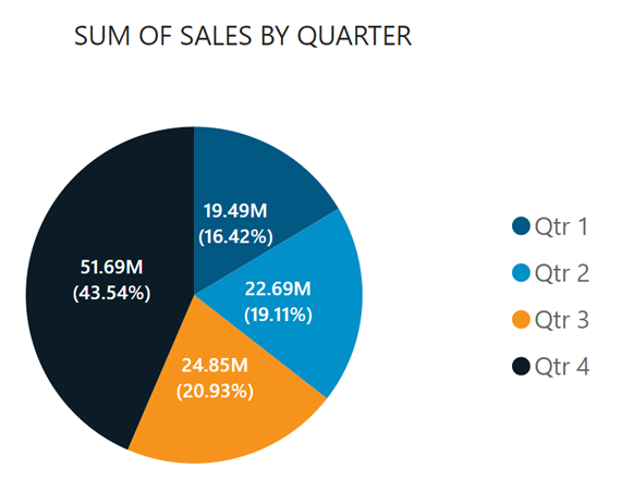
Pie Charts
Pie charts are a good way of showing ratios. For example, the contribution of individual products to total sales (in a given month, year, or year to date). However, if there are more than, say ten categories, pie charts are not useful, as they become too crowded and cannot be read easily.
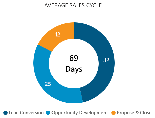
Doughnut Charts (Cycle Charts)
Doughnut charts also show ratios. However, the visualization suggests a process (in a clockwise fashion) and is a good way of showing how much each step of a process contributes to the cycle from beginning to end. An example could be a sales process where step one is converting a lead to an opportunity, step two is developing the opportunity, and step three is closing the sale. A doughnut chart could quickly show how much time (on average) each step consumes. The number in the middle of the cycle represents the total average time of a sales cycle.
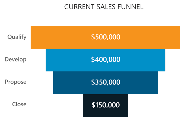
Funnel Charts
A funnel chart is a type of chart that shows the values of different stages in a process, such as a sales pipeline or a conversion funnel. The chart has the shape of a funnel, with the widest part at the top and the narrowest part at the bottom. The width of each section represents the proportion of the total value that belongs to that stage. A funnel chart can help visualize the performance, efficiency, or progress of a process over time.
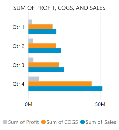
Bar Charts
A bar chart is a type of graphical display that shows the frequency or proportion of different categories or values. It consists of rectangular bars with lengths proportional to the values they represent. The bars can be horizontal or vertical and can be grouped or stacked to compare multiple variables.
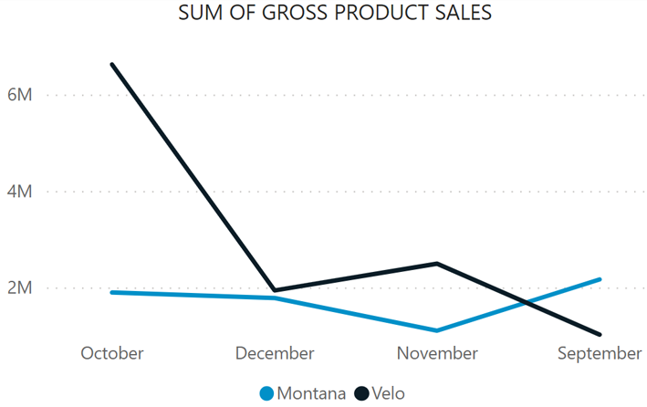
Trend Charts
A trend chart is a graphical representation of how a variable changes over time. It can be used to analyze patterns, identify outliers, and forecast future values. A trend chart typically consists of a line that connects the data points, an x-axis that shows the time intervals, and a y-axis that shows the variable values.
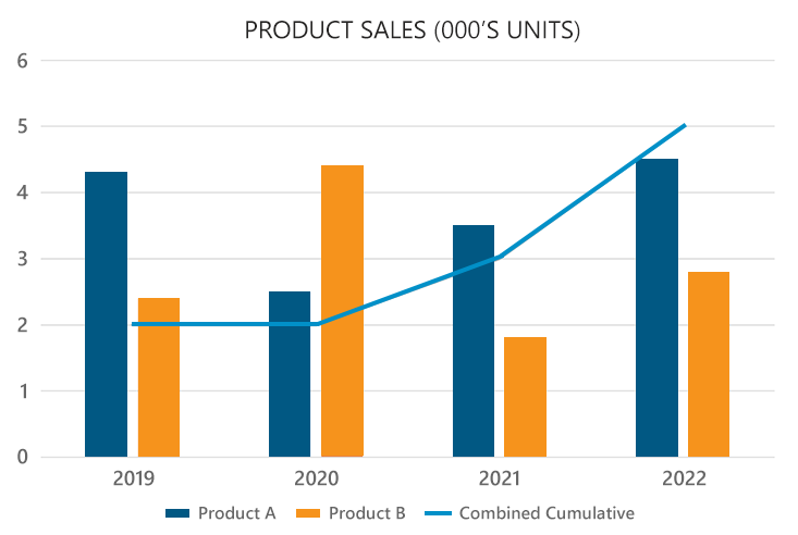
Combined Charts
A combined bar trend chart is a type of data visualization that shows both the absolute and relative values of different categories. It consists of a bar chart overlaid with a line chart, where the bars represent the absolute values, and the line represents the percentage change or trend over time. This chart can be useful for comparing multiple variables across different time periods or groups.
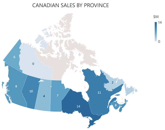
Heat Map Charts
So called “Heat Maps” are a great way of displaying quantities or ratios of entities in a geographical context. For example, a heat map can show total sales by region or country in a given month, year, or year to date. Or the performance of product vendors/distributers in different cities. The map displays overlay elements, such as circles, or regional colors, to quickly convey quantities or ratios thus giving a quick interpretation of sales performance by geographic region.
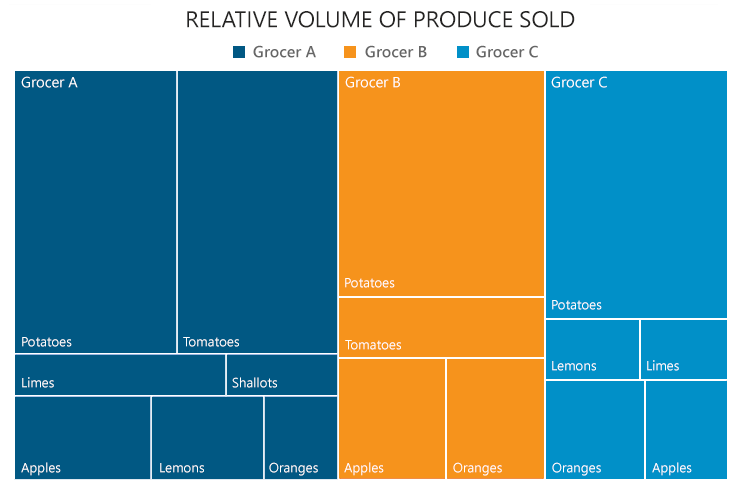
Tree Map Charts
A tree map chart is a type of data visualization that shows the hierarchical structure of a dataset using nested rectangles. Each rectangle represents a data point or a group of data points, and its size and color indicate its value or other attributes. Tree map charts are useful for comparing proportions and relationships within and between different levels of data.
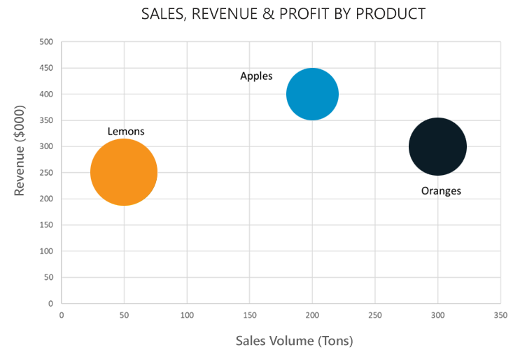
Scatter Charts
A scatter plot chart is a type of graphical representation that shows the relationship between two variables. Each data point is plotted as a dot on a coordinate plane, where the horizontal and vertical axes correspond to the values of the variables. A third property can be represented by the size of the data points. A scatter plot can reveal patterns, trends, outliers, or correlations in the data.
Products Sold by Region 2022
| Region | Product | Total Sales |
|---|---|---|
| Ontario | Apples | $23,098 |
| Ontario | Oranges | $42,938 |
| Ontario | Lemons | $18,086 |
| Quebec | Apples | $45,086 |
| Quebec | Oranges | $29,876 |
| Quebec | Lemons | $54,087 |
Tables
Sometimes, users of business intelligence systems prefer simple tables to display information. Data tables allow you to organize and analyze data in a structured way. Data tables can also help you identify patterns, trends, and outliers, as well as compare different scenarios.
Interacting with Data Visualizations
In modern business intelligence platforms, many elements of data visualization allow interactive features. For example, you can click on a region of a map, or an element of a bar chart, or a point on a scatter plot to reveal the underlying data in the form of a table or a more detailed visualization. Interactive features allow you to navigate through business data rather than just viewing static information.
Putting it All Together
Business intelligence (BI) dashboards and reports are visual tools that combine data visualizations to display key metrics and insights from data sources. They help users to monitor business performance, identify trends, and make informed decisions. A well-designed BI dashboard should have the following characteristics:
- Clear and relevant: The dashboard should focus on the most important information for the intended audience and avoid cluttering with unnecessary details. The dashboard should also use clear labels, titles, and legends to explain what the data shows.
- Interactive and intuitive: The dashboard should allow users to interactively explore the data in different ways, such as filtering, drilling down, or zooming in. The dashboard should also use consistent and familiar icons, colors, and layouts to make it easy to navigate and understand.
- Accurate and timely: The dashboard should use reliable and updated data sources to ensure the accuracy and relevance of the information. The dashboard should also indicate the data source, date, and frequency of update to avoid confusion or misinformation.
- Actionable and insightful: The dashboard should provide insights that help users to answer their questions, solve their problems, or achieve their goals. The dashboard should also suggest possible actions or recommendations based on the data analysis.
Try our interactive demo reports below to see the possibilities.
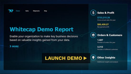
Sales Report Demo
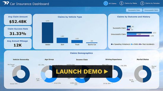
Car Insurance Report Demo
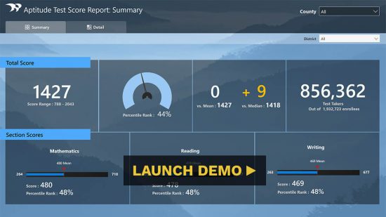
SAT Scores Report Demo
Next Steps
By now you should have a better understanding of what business intelligence is and some of the ways you can measure and present key business data. The next step is for a software development partner to do a deep dive into your data and help put together a BI implementation plan. Ready to get started? Let's chat.