Park’N Fly

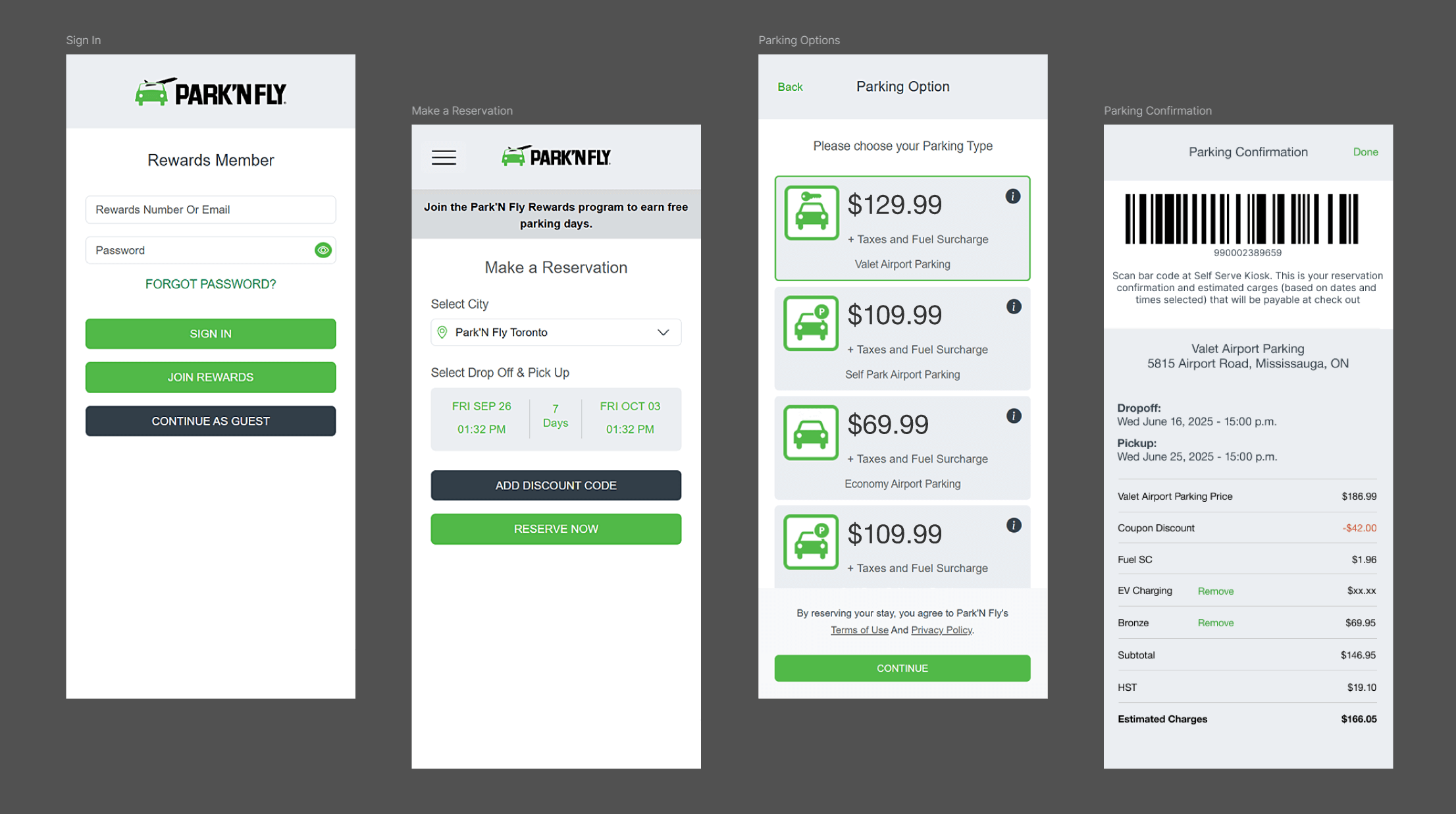
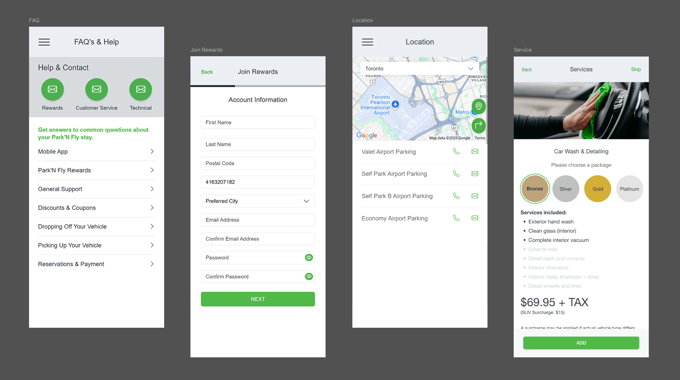

Building on an existing iOS application, Whitecap redesigned Park’N Fly’s mobile application interface to modernize its look and deliver a more consistent, intuitive user experience. The UI was reimagined with a simplified, cohesive design language—replacing inconsistently styled page headers, buttons, and iconography. Calls to action were clearly categorized and prioritized, click target sizes were increased for better usability, and generous spacing was introduced to improve readability and navigation. The result was a visually appealing, user-friendly interface that felt both polished and purposeful.
Additionally, certain areas of the app had directly replicated content from the Park’N Fly website, leading to a suboptimal experience on mobile devices. For example, while a multi-column comparison table worked well on the website for outlining rewards level benefits, it was difficult to interpret on a small screen. To address this, we replaced the table with a set of tabbed panels, allowing users to easily swipe or tap through each rewards level for quick, side-by-side comparison—optimized for mobile viewing without sacrificing clarity or content.