Power BI

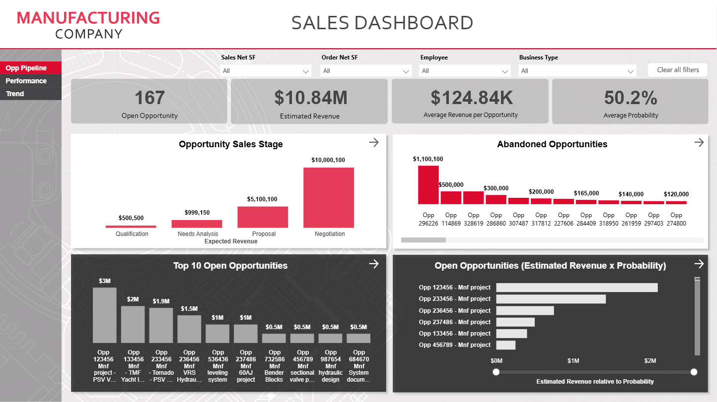
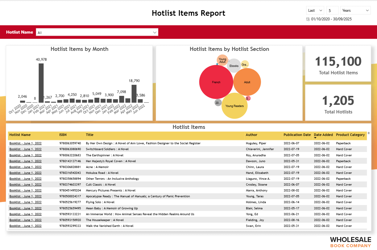
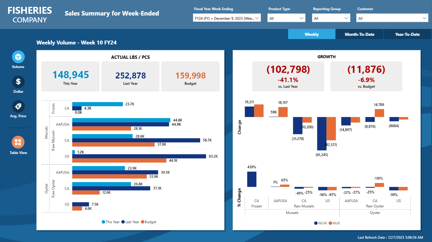
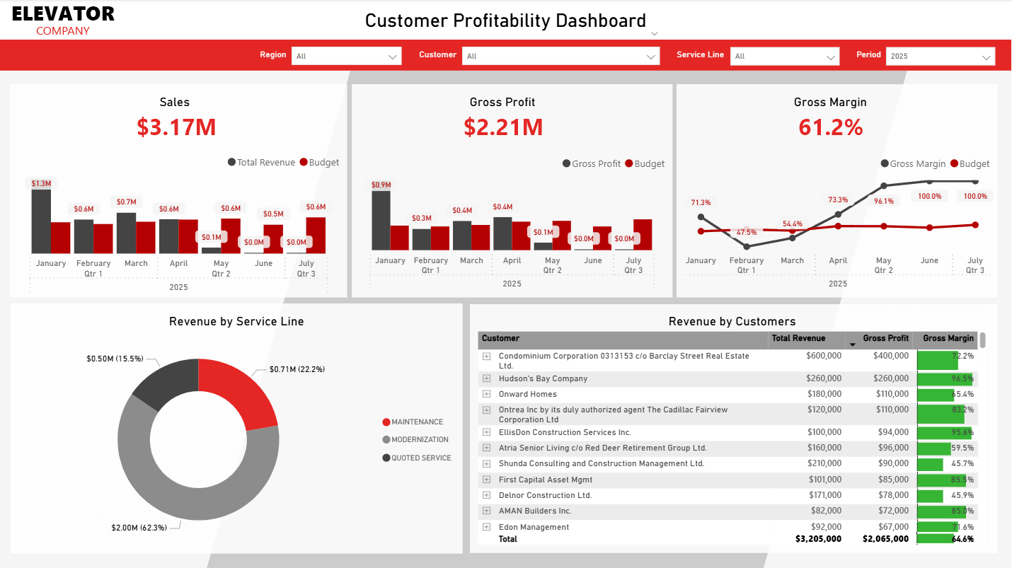
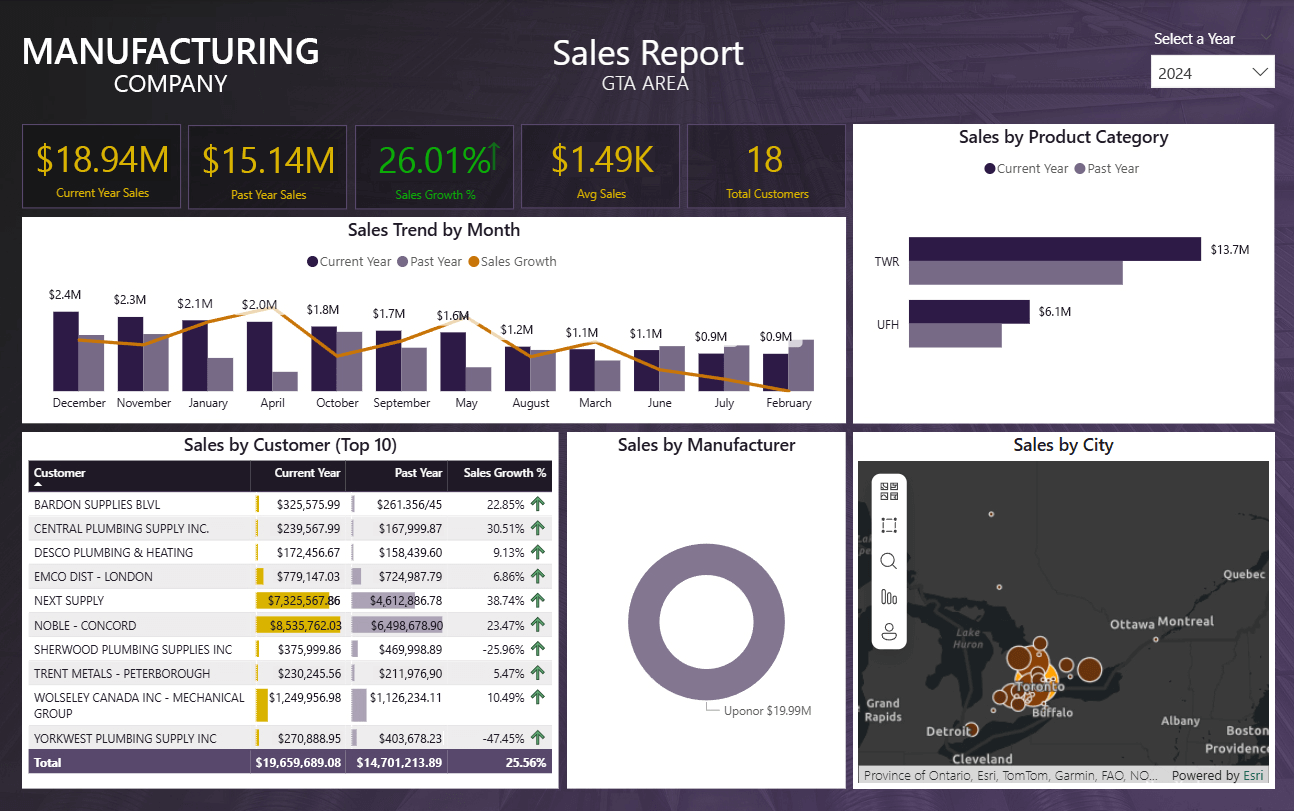

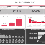
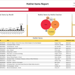
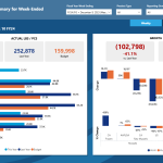
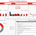
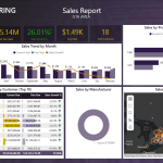
Clients from a variety of industries have turned to Whitecap to create new Power BI reports or reimagine their existing ones. While each project came with its own set of requirements, complexities, and challenges, all clients shared a common goal: to present complex data and metrics in a format that is clear, engaging, and easy to understand at a glance.
To meet this goal, we focused on selecting the most effective visualizations, optimizing layout and hierarchy, and applying thoughtful use of colour contrast and styling. Simple iconography was introduced to enhance visual interest and provide intuitive navigation cues. Each report was further customized through the careful integration of corporate branding elements, subtle background imagery, and purposeful typography—resulting in dashboards that were not only functional and user-friendly but also polished and visually distinctive.