Whitehots
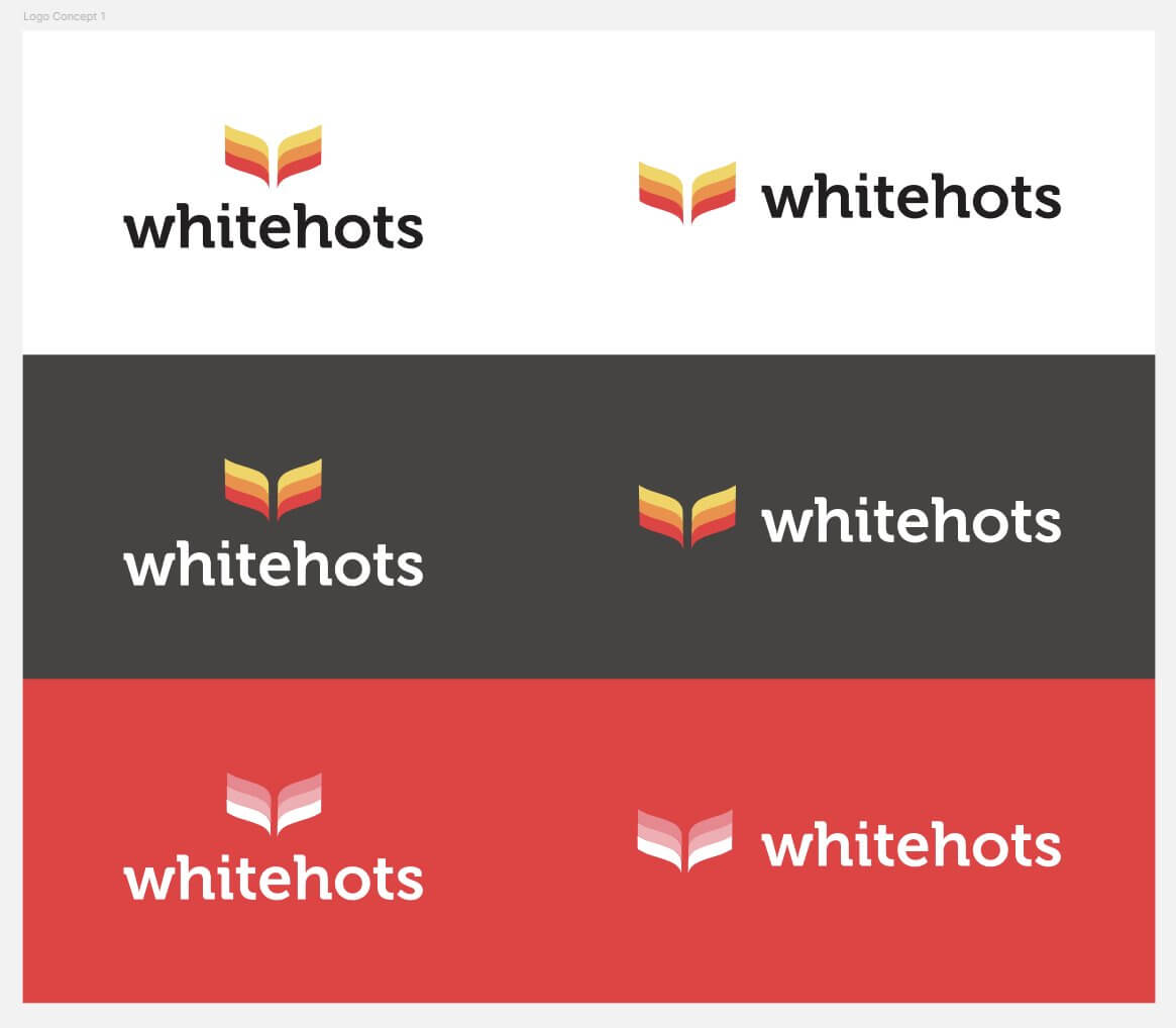
When Whitehots approached us in 2020, they were looking for a bold new identity that could better express their innovative role as a partner for libraries across Canada. We developed both the brand and the website from scratch, using the concept of “hot off the shelves” as a central creative thread. This idea informed not only the name and logo, but also the design aesthetic, which combined clean lines with subtle motion and energy.
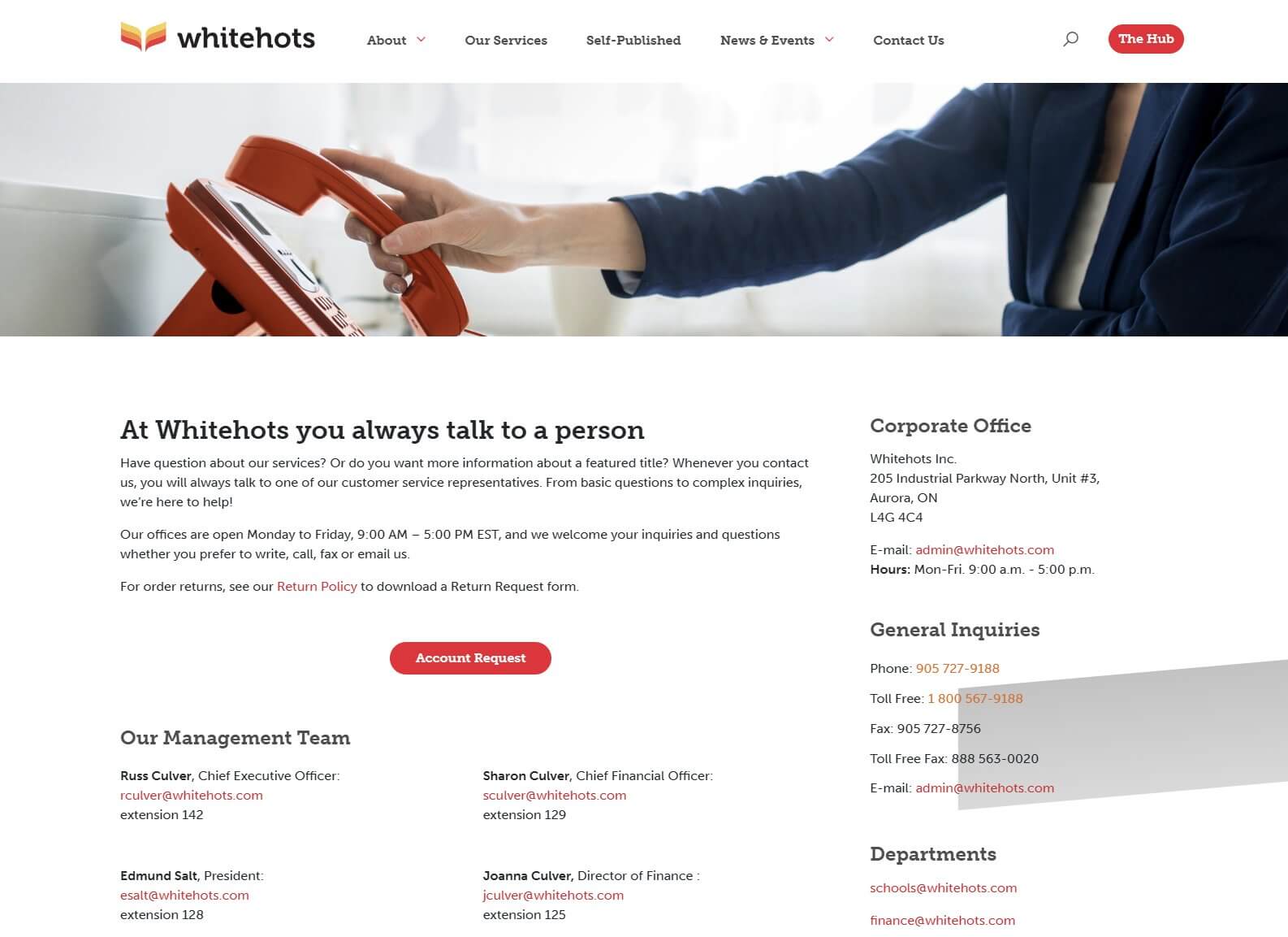
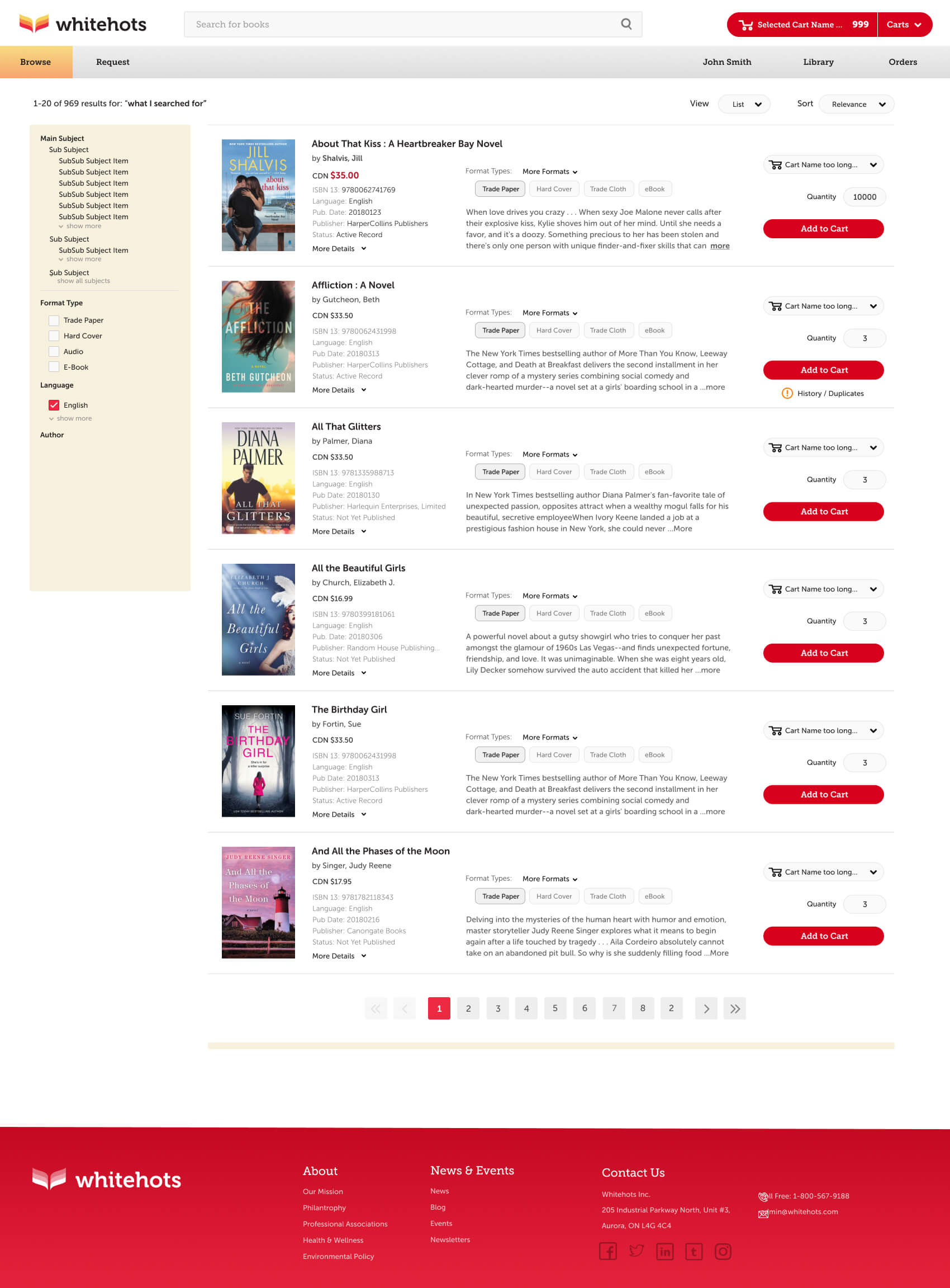
The new digital presence positioned Whitehots as approachable yet professional. The website balances functional navigation with moments of delight, such as interactive elements that reinforce the brand’s dynamism. Thoughtful use of typography, color, and spacing ensures that information is easy to find while maintaining a modern, engaging visual appeal.
Most importantly, the site tells the Whitehots story in a way that resonates with both libraries and end-users. The fresh brand identity helped them stand out in a traditional sector, signaling innovation and forward momentum. The result is not just a marketing tool, but a living digital platform that communicates Whitehots’ values and vision while supporting their ongoing growth.


