|
Getting your Trinity Audio player ready...
|
For much too long, the world of technology and website/software development saw user interface (UI) and user experience (UX) design as an afterthought. It was nice but not necessary. Maybe even a bit frivolous. It was an add-on at the end of the conveyor belt. A bonus feature.
While that mindset has certainly shifted, updating development processes to incorporate UI/UX design best practices from the start has taken longer to catch up. To the frustrations of UI/UX designers, it is still often not talked about in the early phases of a software development project. The focus is on features, functionality and technology. Then the designers are handed a finished product and told “here, make it pretty.”
Studies have shown that design-led companies like Apple, Coca-Cola, Nike, and Starbucks outperform their competitors by over 228%. For these companies, design is not just about cosmetics and pixel-pushing. Design is function. It is holistic. It is how products become trademarks, and how companies become icons.
Achieving a great user experience means making customer-centricity a focus across the entire customer journey and across platforms. It’s about understanding who will be using your application(s) and how, and how that fits into all their interactions with your business.
We asked our own UI/UX designers to share best practices they like to follow and UI/UX blunders that drive them crazy. Here’s what they had to say.
UI & UX Design Best Practices From Our Experts
-
Alfred Lee, Manager of Design, UI & UX
-
Janice Leong, Creative Designer
Q: What general UI/UX design process do you follow when kicking off a new website or application build with a client?
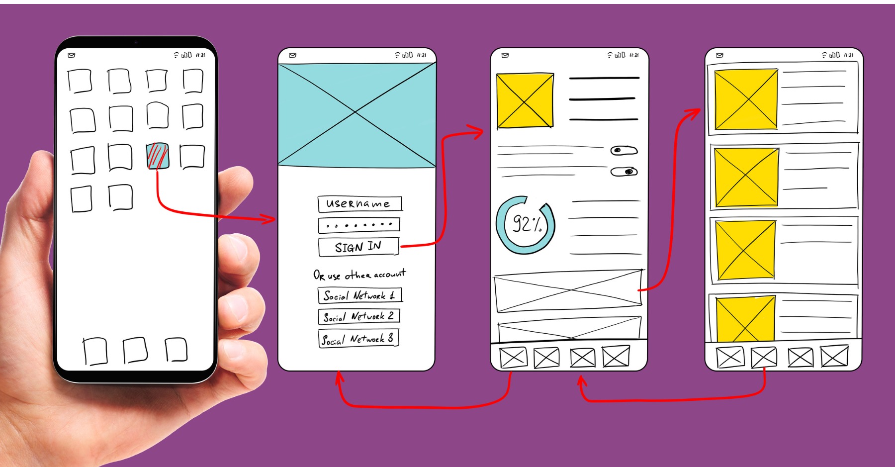
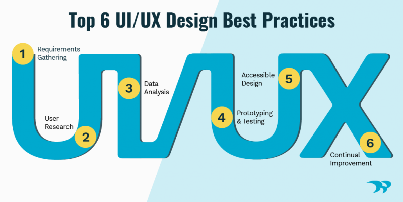
Alfred: There are a few key steps in the UI/UX design process that we follow here at Whitecap. We start by gaining a deep understanding of the brand, requirements, and overall project objectives. Then, we conduct user research using a mix of interviews, surveys, heatmaps, analytics and usability testing to gather the user data that will inform the site or application design. We analyze the collected user research to develop user personas, journey maps and wireframes, then begin mapping a new solution.
Once everyone is happy with the proposed user experience, we move on to designing high-fidelity mock-ups including any custom images, icons, brand colours and prototypes. Finally, we test, launch and iterate. Even after launch the project is never complete. Once users have access to the software solution, there is new information and usability data coming in that we can use to continually improve the solution.
Janice: Before we design anything, we take the time to understand the purpose of the website or application we’re building. Who is it for? How will it be used? Once we know that, we start brainstorming and sketching out initial concepts for the key UI design elements and navigation flow.
Next, we create low-fidelity, black and white wireframes to establish page templates and general placement of UI elements. Ideally, we like to build a prototype using the wireframes so clients can interact with them and help fine-tune the functionality. This can be a challenging step for clients because they want to see the colour scheme, typography, images, etc. But the purpose here is to nail down site flow, usability and UX, and we don’t want to get distracted with visual design details.
Once everyone is happy with the flow, we create high-fidelity mock-ups of the main pages. This is where we start incorporating branding, colours, styled elements, etc. We always consider the experience of all users by designing with accessibility in mind.
Q: In your opinion, what are the top UI/UX best practices every project should include?
Alfred: Always allocate a sufficient amount of time for user research and analysis. It’s tempting to skip these stages and jump right into design for the sake of cost-cutting. But not taking the time to understand your users and how they will interact with your site or application can be a very costly mistake to fix down the road.
Prototyping is another step of the UX process that can appear costly and unnecessary. However, adding in that layer of interactivity during the design phase really helps our clients “see” how the solution will look, feel and function. It’s also a great way to catch any issues with the UX and quickly improve them before building the final product.
Janice: In my view, every design solution should strive for two things: simplicity and ease of use. Keep the UI design and UX as simple and straightforward as possible, while still being useable and understandable. Keep the concept of affordance in mind when designing. What something does and how it works should always be obvious and accessible to users.
Also, design UI and content elements consistently and in accordance with style guides or UI pattern libraries.
Q: What are some common UI/UX blunders you see that drive you crazy?
Alfred: Stakeholders assuming they are their target users, or thinking they know the target users. Essentially building a solution for someone like themselves. Pre-conceived ideas and biases of what a user wants or needs aren’t always accurate and could mean you are developing a product that won’t succeed in delivering the best UX you’re seeking.
Another blunder that I see frequently is skipping user research all together. This often leads to a solution being built based highly on assumptions, which leads to canned user interfaces and lackluster design. These solutions may create new problems rather than solving them.
Janice: Bad forms! Forms with no text input examples. You fill out the entire thing, only to get an error message informing you of the correct format. Even worse, when the error message pops up at the top of a long form and you have to comb through it all again fixing the errors. And the cherry on top is submitting the form and not even getting a confirmation message at the end, so you have no idea if it all went through.
Generally, poorly thought-out UI that is difficult to use. For example, long, cumbersome drop-down lists used to select birth date or location. UI that is too simple and sparse, where the user has to try clicking on or hovering over every element they can see in order to figure out how an app works.
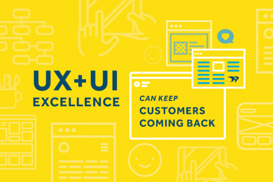
The Bottom Line: Follow UI/UX design best practices to build a customer-centric solution
Whether you are building a new website or application, the key to its success is keeping your users at the center of the design process from beginning to end. Skimping on key steps in the UI/UX design process—like user research, prototyping and testing—can lead to a poor user experience and low usability.
When you’ve invested a lot of money into a project, the last thing you want is to show the final product to your users only to find out it doesn’t meet their needs and you have to spend more money fixing it. Worse yet, if it’s a source of revenue (like an ecommerce site or app) you may end up losing instead of gaining paying customers.
Ready to start building your customer-centric solution? Let’s chat.